|
Required Questions
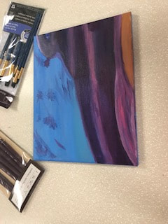
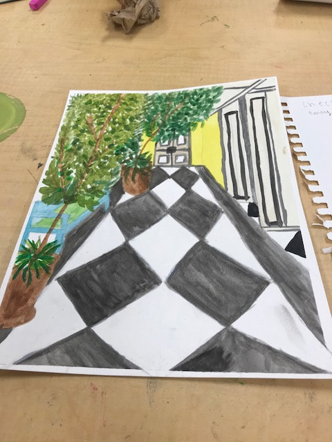
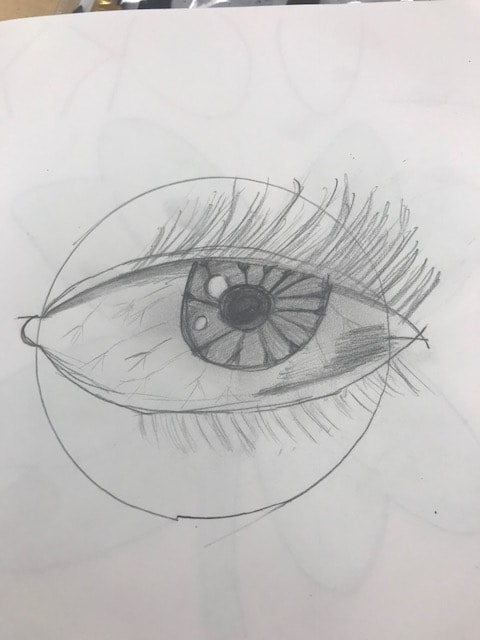
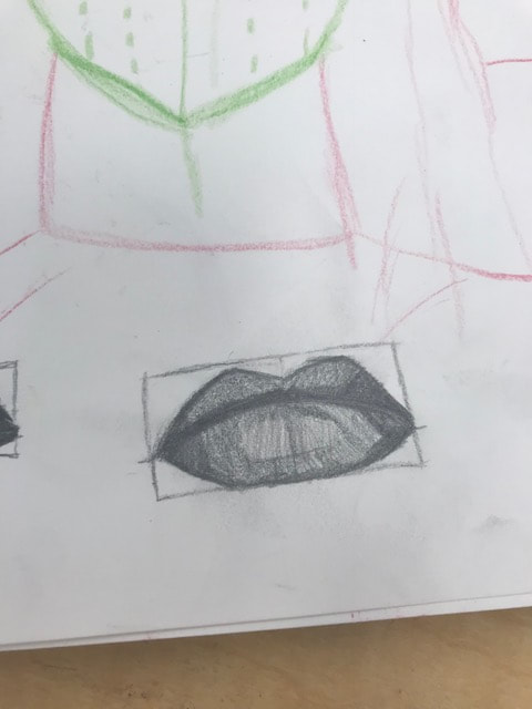
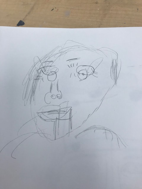
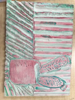
Three Questions What was the warm up or sketchbook assignment that you learned the most from? The warm up that helped me the most this semester was probably the water color warm up. It's the one with the four different sections and in each they have different techniques to do with your brush. This really helped me when it came to my watercolor piece, when i had to develop skills in order to make it look realistic Regardless of whether a project was successful or not, describe the one where you learned, grew, or developed the most from? Please explain. The project that i learned the most from was my portrait piece of my little sister. I’ve always enjoyed painting and going in art 1 i was looking forward to a project like this. Painting my little sister was very special and was the reason it was so successful, even though i never got to finishing it. During this project i developed skills in learning how to mix certain paints to make skin tone colors (which was very hard), and sketching out details of facial structures. I personally think i grew in painting a lot in this piece and hope i can do something like it again. Do over: If given the opportunity, which project would you do over? Describe why and how you would redo this project. Reasons might include choosing a different theme, using a different medium or creating a different idea completely. Include photo. I think the project i would definitely want to do over was my watercolor/perspective piece. Perspective drawing was really hard for me to learn and doing it with watercolor made the process a lot harder for me. The picture i chose to do was at the Carolina Inn, and the angle it was taken at made connecting the points difficult and made it seem a little messy and unrealistic. So therefore i wish i would have done a different picture to base my picture off of, like maybe something at the beach because i'm a little more passionate about the ocean. Pictures for the above Questions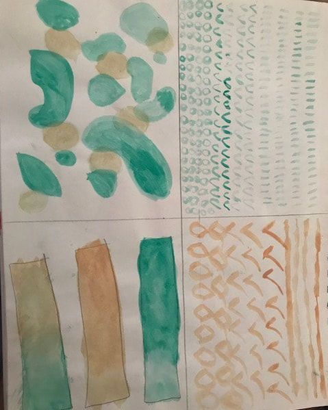 Picture for question 1. 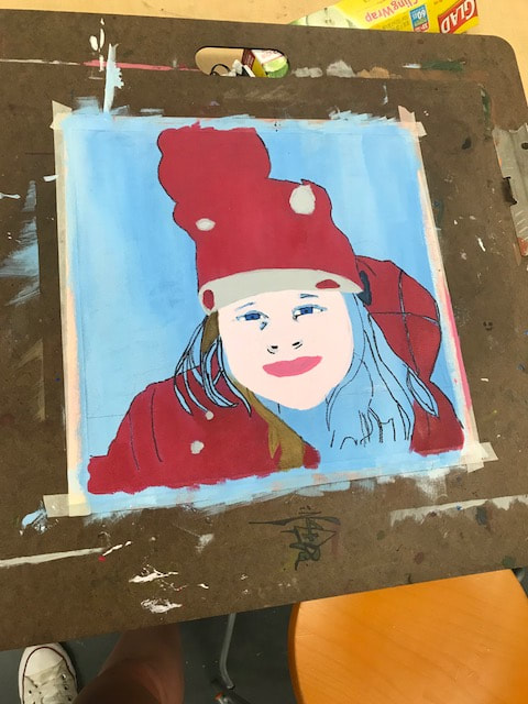 Picture for question 2.
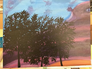
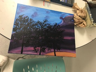
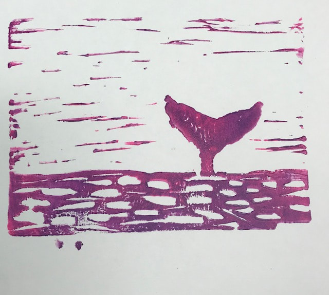
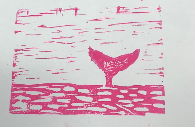
Pictures for question 3.
0 Comments
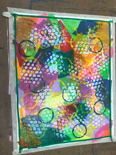
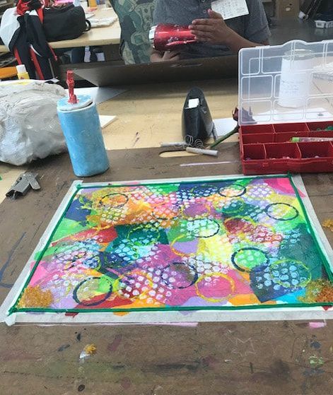
The first medium i used for my multi media piece was ripped off pieces of tissue paper in a variety of different colors. I glued down the tissue paper with Hodge podge to make sure it stayed on my piece. The second layer is the white circles, which i used white paint and a piece of bubble rap to create the dots seen. The third medium i used was the border which is green yarn all around my piece. The fourth layer is the yellow and blue circles, which i used a lid to play dough to create a sort of rigged circle to top the piece. Lastly, i decided to use little flower beads and place them on the corners of the page to add a different aspect to my piece.
For my piece i didn't really use words but the general idea is positive vibes and just overall a happy outlook. Lots of people did pieces describing low points of life and i sort of wanted to do the opposite. so i used bright colors on my piece to show this positive energy i wanted my piece to portray. 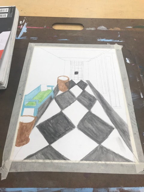  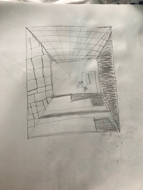 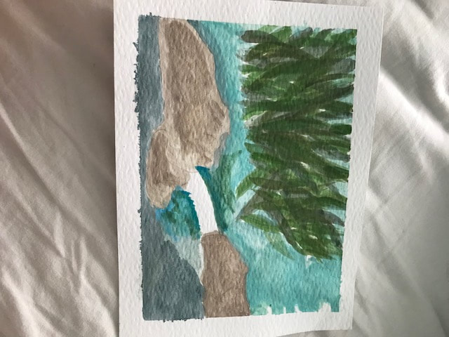 For my water color painting i used 1 point perspective. the perspective is from down a hall way which connects all together. The photo i chose to paint i took at the Carolina inn, in UNC Chapel Hills campus. I found that the most difficult thing to do was putting all the details together from the perspective of looking at it. This has been the hardest project for me, but it was pretty fun messing with the water color. I picked these warm ups because the hallway one really helped me see how to form a picture from a certain point, and it really showed through my painting. The coloring book warm up was the most helpful because it taught me how to from plants and greens in which i used on my trees in my actual painting, they are my favorite part of the picture.
 For my portrait piece i decided to do my sister. She inspires me everyday and i wanted to do something special for her. The medium i chose was painting i like painting a lot and find it fun, especially when it comes to painting portraits. First, i started with tracing out my picture on to the canvas and putting together each detail. Second, i painted the outfit then i went onto facial contour and hair. Since i didn't finish in time, i was not able to touch up the back round, but so far the portrait is coming together how i wanted it to. i feel like what went really well was how the details on the face came together i was really nervous about how to make the skin tones and eye color but it came together better than i thought, i don't think i would change anything about the process it worked really well for me.
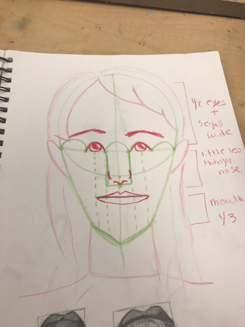
I would say the most helpful warm up for me so far has been the face proportions one. I've learned how to measure and make sure that the face is exactly where it would be in the picture verse on the canvas piece. Since im painting, its also helped a lot because i know where all the colors go with the even proportions.
What i found most surprising about the face proportions warm up was how the eyes and nose match up and really affect the rest of the face. I say this because the eyes and nose really are important to the face and our unique towards each individual. 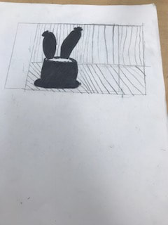
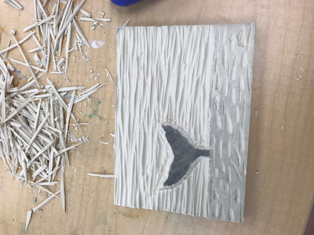
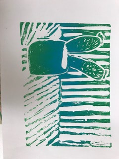
My piece shows of the line theme mostly due to its back round proportions. At first i didn't have anything that had to do with the line theme but then i realized i could incorporate lines by making the cactus plant look like its sitting on a counter top.
I really like how my piece turned out. At first i really didn't know how i felt about it, but once i started to print my piece i liked it a lot because it had sort of a rustic feel to it due to the way it came out. Also i think that my color mixture worked really well together. I used blue. green, and some white to give it the color mix shown above. Basically, i wouldn't really change anything about my piece i ended up liking it a lot. 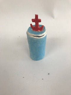 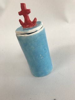 To complete my piece it first had to be fired, which took a few days. Then i used a blue Glaze for the body of my piece. Then i used a red Glaze for the anchor on my lid. This process took me about two days because i put many layers on my piece so that the color would pop. Finally, my piece would finish by being fired for the second time. Then it ended up looking like the images above.
I think that the color really was successful overall. I wasn't fully sure of how it was going to look but i'm glad that it turned out brighter rather than lighter. I also really like how the anchor shape turned out, i'm happy that it stayed attached during the firing process. I would probably have changed the shape of my piece. I personally think that it was to tall, and that if i were to use it to hold things that it would be difficult to get the item out of. To accomplish this i would maybe trim it down a bit but keep it that cylinder shape. 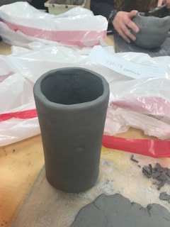 For my piece i plan on making a cylinder shaped pot, that has waves carved into the exterior. Than for the lid i plan on making an anchor that you can take the lid off with. My theme is based on the beach or water.
I have found that making my piece even all around is hardest, other than that everything else is going smoothly. I think its hardest for me because when i shave it down a little i end up taking off more than i wanted to. i think that the shape of my piece is going well so far, the idea i had in my head looks really similar to what i have made so far. To make my piece i have used the scratch method to attach my bottom and the layers together. I also use this to even out some of the more thick parts of my piece. To make my piece not have any marks on it i use the slab roller to make it as clean as possible so its presentable. Slipping is a process i used to attach my corners and pieces as well, which is very helpful if you want your piece to stay together. Tested Colors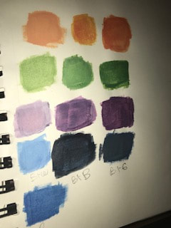 When we tested our colors i learned a lot about how a tiny bit of one color can affect the whole outcome. Especially when it comes to making the color lighter or darker, you have to measure the exact amount you want to make that color right for your painting. How to make brown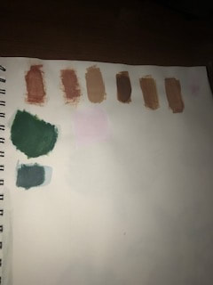 To make brown you mix blue and orange you can change the hue by adding different colors with the blue and orange. For example, to make the brown darker you could add a little bit of purple. 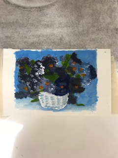 Painting over photo.
|
AuthorWrite something about yourself. No need to be fancy, just an overview. Archives
May 2018
Categories |

 RSS Feed
Photo used under Creative Commons from wilson leonel
